Display Glossary
DCI-P3, sRGB and colour gamut. — Which slice of the rainbow your screen actually sees.
Colour gamut is the range of colours a display can reproduce — drawn as a triangle inside the horseshoe of human vision. Different standards trace different triangles. Which one matters depends entirely on what you're looking at.
- web baseline
- 100% sRGB
- DCI-P3 over sRGB
- +25%
- accurate target
- dE < 2
What a colour gamut actually is
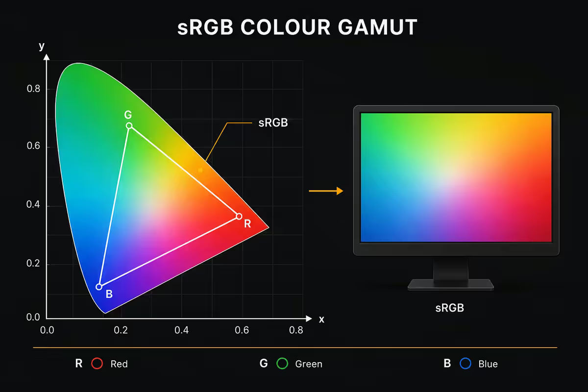
Human vision sees a finite range of wavelengths — roughly 380 to 750 nanometres of light. Plot every visible colour onto a 2D chart and you get the famous CIE 1931 chromaticity diagram: a horseshoe-shaped surface containing every hue and saturation a human eye can distinguish, with white at the centre.
No display can show every colour on that horseshoe. Every monitor, every TV, every phone screen reproduces a subset of human vision — bounded by what its physical pixels (red, green, blue) can emit. Plot those bounds on the horseshoe and you get a triangle. That triangle is the device's colour gamut.
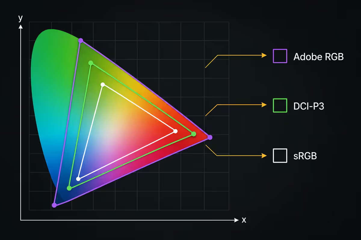
Different industries needed different triangles for different purposes — the web needed a baseline everyone could agree on, cinema needed a wider one for HDR mastering, print needed one that matched ink behaviour. So a handful of standards emerged, each defining a triangle. When you see "99% sRGB" or "95% DCI-P3" on a monitor spec sheet, it's telling you how much of that target triangle the panel can reach.
sRGB — the web's universal language
sRGB was created by HP and Microsoft in 1996 as the lowest common denominator for the early web. The aim: a colour space simple enough that any 1990s CRT monitor could roughly approximate, so a JPEG uploaded in one country would look reasonably consistent everywhere.
Thirty years later, sRGB is still the colour space the web runs on. Every website, every YouTube video at SDR, every Twitter image, every Instagram post is encoded in sRGB unless explicitly tagged otherwise. Windows assumes sRGB by default. macOS assumes sRGB by default for untagged content. If you're not editing photos or video for HDR or print delivery, your entire visual life is sRGB.
For a monitor, "99-100% sRGB coverage" means you can see web content as the creators intended. Below 95% sRGB, you start losing the saturated cyans, magentas and yellows that the standard expects — corporate logos look slightly off, skin tones drift.
DCI-P3 — what cinema and HDR use
DCI-P3 (DCI = Digital Cinema Initiatives) was defined in 2007 for digital film projection. It captures roughly 25% more colour area than sRGB, with the extra reach concentrated in deeper reds and richer greens — exactly the colours cinema cinematographers want for skin tones, fire, foliage and sunsets.
DCI-P3 became the gamut that modern HDR rests on. Netflix Dolby Vision, Apple TV+, HDR-mastered games and almost all 2020s premium content is delivered in P3. Apple adopted DCI-P3 as its system gamut starting with the 2015 iMac, and every modern iPhone, iPad and Mac display is P3. Many Windows laptops (XPS, Surface Studio, premium ASUS) now ship P3 panels too.
Where DCI-P3 matters for you:
- Watching HDR-mastered Netflix, Apple TV+, Disney+ content on a capable display.
- Playing HDR-graded modern games (Cyberpunk 2077, Resident Evil 4, Forza Motorsport).
- Editing video for cinema or streaming HDR delivery.
- Photo editing where you'll deliver to modern phones and HDR-aware platforms.
Where DCI-P3 does not matter: ordinary web browsing, office work, programming, SDR YouTube, most older games, and any work delivered to the broader web where sRGB clipping is the lowest common denominator anyway.
Adobe RGB — for print delivery
Adobe RGB (1998) was designed by Adobe to match the colours achievable on professional CMYK offset printing presses. Its triangle is roughly the same area as DCI-P3 but oriented differently — it includes more cyan-green than P3 (matching the cyan in CMYK ink) and slightly less deep red.
If you produce magazines, brochures, packaging or fine-art prints, Adobe RGB is your working colour space. The extra cyan-green range lets you preview what will print accurately on a colour-managed press. Most professional print-oriented monitors (Eizo ColorEdge, BenQ SW series) advertise Adobe RGB coverage rather than DCI-P3 for this reason.
If you don't print professionally, you don't need Adobe RGB. Photographers delivering to Instagram, websites and modern HDR phones are better served by a P3 panel than an Adobe RGB one in 2026.
Rec.2020 — the future target nobody reaches yet
Rec.2020 (formally BT.2020) is the UHD broadcast and HDR standard adopted in 2012. Its triangle covers roughly 75% of all human-visible colour — about 35% larger than DCI-P3 — and includes colours so saturated they can only be produced by laser-pure narrow-band emitters.
In 2026, no commercial display reaches 100% Rec.2020. The state-of-the-art professional reference monitors (Sony BVM-HX3110, Apple Pro Display XDR, Eizo CG3146) reach 85-90% Rec.2020 coverage at extreme prices. Consumer panels (LG OLED, Samsung QD-OLED) typically reach 70-80% Rec.2020.
Rec.2020 is the gamut HDR content is encoded in, but most displays render it through DCI-P3 hardware with gamut mapping. The result: Rec.2020 content looks great on a P3 display, even better on a wider one. You don't need to chase Rec.2020 coverage in 2026 — there's nothing to gain that current content actually uses.
Coverage vs volume — the distinction that catches people out
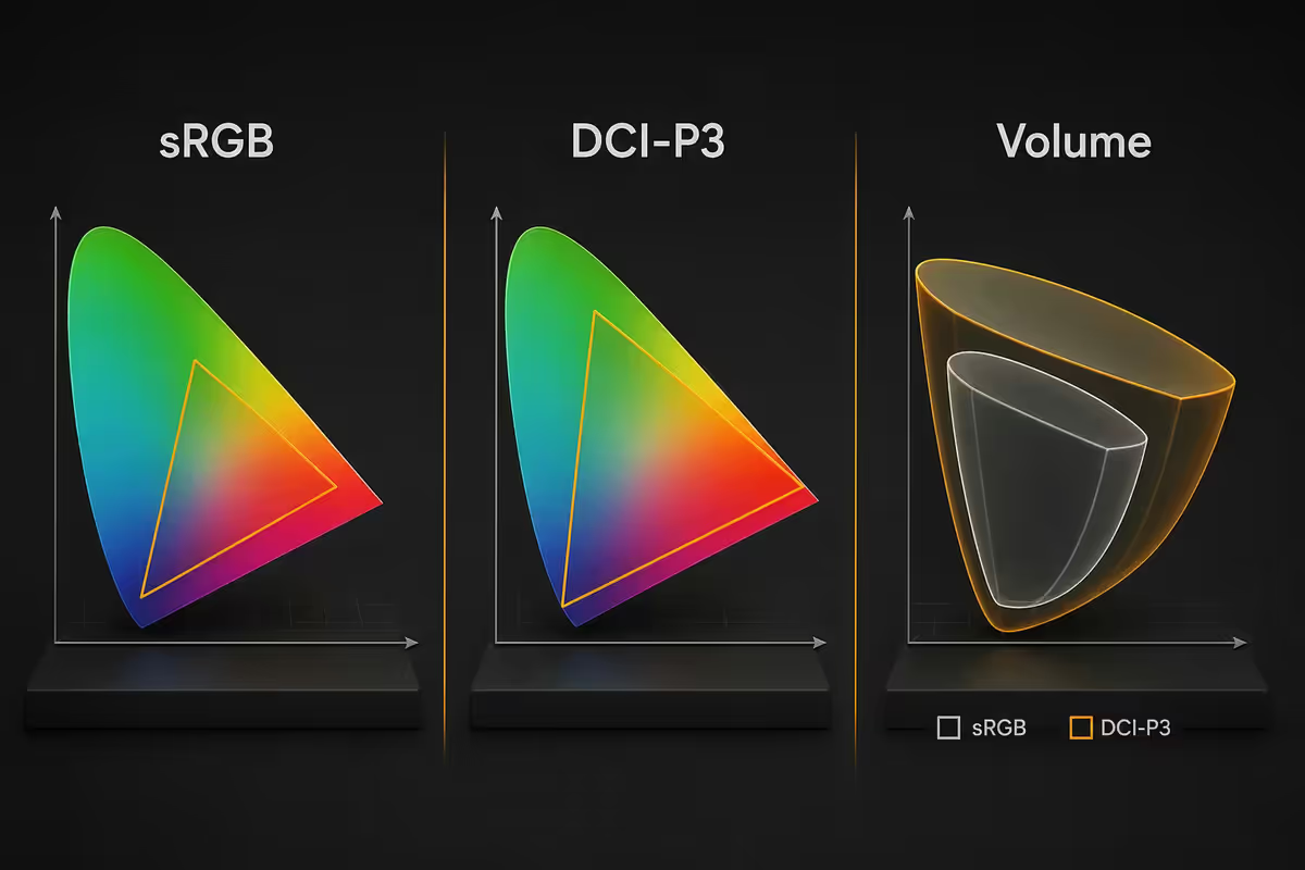
A monitor spec sheet might say "99% DCI-P3 coverage, 95% DCI-P3 volume". These mean different things:
- Coverage measures the 2D area of the gamut triangle the panel reaches. It's a flat measure: how much of the target colour palette can the display produce at all?
- Volume includes brightness. A 3D measure: does the display hold colour saturation across the brightness range, or do colours wash out at high luminance or crush at low?
For HDR content, volume matters more — HDR pushes peak brightness into territory where weaker panels lose colour saturation. For SDR content, coverage is the practical metric and volume is mostly academic. Most consumer reviews quote coverage; professional reviews quote both.
Why Windows and macOS show colours differently
Here's a detail that surprises many buyers: the same wide-gamut monitor can show wildly different colours under Windows and under macOS, with no hardware change.
macOS is fully colour-managed at the OS level. Every macOS app — Safari, Chrome, Photos, Final Cut, even the built-in screensavers — queries the display's colour profile and translates content through it. An sRGB JPEG displayed on a P3 Mac display will look exactly as the photographer intended — accurate, not oversaturated.
Windows colour management is partial. Photo Viewer, the new Photos app, modern Edge browser and professional apps like Photoshop and Lightroom respect the display profile. Many legacy apps, older games, and a lot of UI chrome do not — they assume sRGB and dump raw RGB values to the display. On a wide-gamut Windows monitor, this means an sRGB JPEG looks oversaturated, with red logos glowing neon and skin tones turning ruddy.
What this means practically:
- On Windows, choose a monitor with a hardware sRGB clamp mode if you do non-photography work and want accurate web colour. Most modern panels include this.
- On macOS, you can buy any P3 display and content will look correct everywhere.
- For photo and video editors on Windows, use Photoshop / Lightroom / DaVinci Resolve where colour management is reliable, and switch the monitor to sRGB mode for web preview.
Calibration — when it's worth it
Even a panel that claims "99% DCI-P3" can be inaccurate out of the box. Calibration measures the actual colour the panel produces against the target and applies corrections — either through the display's OSD settings or through an OS-level ICC profile.
Three tiers of calibration relevance:
- Factory-calibrated, dE<2 — the panel ships measured and corrected by the manufacturer. Sufficient for most users. Look for this on the spec sheet.
- Software calibration without hardware — Windows Display Calibration wizard, macOS Calibration Assistant. Largely cosmetic. Can fix gross errors but cannot measure actual colour accuracy.
- Hardware colorimeter calibration — X-Rite i1Display Pro, Spyder X Pro, Calibrite Display Pro. R5,500-R8,500 in SA. Necessary for professional colour work. Recommended every 6-12 months.
The honest threshold: if you've never edited a photo professionally, you don't need a colorimeter. A modern factory-calibrated monitor is more than accurate enough for everything from gaming to office work to casual photo editing.
Picking a monitor by gamut — what to look for in SA stock
| Use case | Gamut target | Example panels & price tier |
|---|---|---|
| Web / office / gaming | 99% sRGB | Any modern IPS or VA panel from Dell, LG, ASUS, Samsung. R4,000-R7,000 tier. |
| HDR gaming / streaming | 95%+ DCI-P3 | LG UltraGear OLED, Samsung Odyssey OLED, premium ASUS ProArt. R12,000-R30,000 tier. |
| Photo editing | 99% DCI-P3 + factory dE<2 | BenQ SW270C, ASUS ProArt PA279CV, Dell U2723QE. Factory cal sheet included in box. |
| Print / Adobe RGB workflow | 99% Adobe RGB hardware cal | Eizo ColorEdge CS / CG, BenQ SW321C. R25,000-R80,000 tier. Hardware calibrator included or essential. |
Key takeaways
- Colour gamut is the triangle of colours a display can reproduce inside the horseshoe of all visible colour.
- sRGB is the web's baseline — 99-100% coverage is the floor for any decent monitor.
- DCI-P3 is roughly 25% wider than sRGB and matters for HDR content, modern Apple ecosystems, and creator delivery.
- Adobe RGB is for print workflows; Rec.2020 is a future target nobody fully covers in 2026.
- Calibration accuracy (dE<2) matters more than nominal gamut size. Factory calibration is enough for most users.
Frequently asked questions
What is a colour gamut?
A colour gamut is the range of colours a display, printer or capture device can reproduce, drawn as a triangle within the larger horseshoe of all visible colour (the CIE 1931 chromaticity diagram). Different standards define different triangles. sRGB is the smallest of the common ones; DCI-P3 covers roughly 25% more colour area; Rec.2020 is larger still but currently unreachable for consumer panels.sRGB vs DCI-P3 — which gamut matters for me?
For web browsing, office work, programming, and most gaming, sRGB is the only gamut that matters because that's what the content was created in. DCI-P3 matters for HDR-mastered content — Netflix Dolby Vision, HDR-graded games, Apple TV+ HDR — and for photo or video editors who deliver to cinema or HDR targets. If you don't know which applies to your work, sRGB is fine.What does '99% sRGB' or '95% DCI-P3' mean?
It's the percentage of the gamut's colour area that the display can reproduce. 99% sRGB means the panel covers 99% of the sRGB triangle — essentially complete coverage. 95% DCI-P3 means it covers 95% of the larger DCI-P3 triangle. Higher percentages mean fewer colours the panel cannot show. Below 95% sRGB you start to see noticeable inaccuracy in skin tones and saturated colours.What is Adobe RGB and who needs it?
Adobe RGB is a gamut designed in 1998 to match the colours achievable by professional CMYK printers. It includes more cyan-green than sRGB and is the working space for print designers, magazine layouts, and photographers delivering to print. It's roughly the same total area as DCI-P3 but slanted toward print colours rather than cinema colours. If you don't print professionally, you don't need Adobe RGB.What is Rec.2020 and why don't displays cover it?
Rec.2020 (also written BT.2020) is the UHD broadcast and HDR standard with a gamut roughly 75% of the visible spectrum — about 35% larger than DCI-P3. No commercial display covers 100% Rec.2020 in 2026; the best high-end professional monitors (Sony BVM-HX3110, Apple Pro Display XDR) reach around 85-90% Rec.2020 coverage. Consumer panels typically reach 70-80% Rec.2020. It's a future target standard, not today's reality.Why does Windows show colours differently from macOS?
macOS is fully colour-managed at the operating system level — every app, including web browsers, knows the display's colour profile and adjusts content accordingly. Windows colour management exists but is partial — many apps (older games, non-photography software) ignore the system profile and display content as raw RGB values. The result: a wide-gamut display showing 'too saturated' colours under Windows for non-colour-managed apps. macOS handles this transparently.Do I need to calibrate my monitor?
Only if colour accuracy matters to your work — photo editing, video grading, print design. A factory-calibrated panel (look for 'factory-calibrated to dE<2') is sufficient for most users. Professional colour work benefits from re-calibrating every 6-12 months using a hardware colorimeter (X-Rite i1Display Pro, Spyder X Pro, R5,500-R8,500). Software-only calibration with no hardware probe is largely cosmetic.Gamut coverage vs gamut volume — what's the difference?
Coverage measures what percentage of the target gamut triangle the display reaches — a flat 2D measure. Volume includes brightness, measuring the colour the display reproduces across luminance levels — a 3D measure. A display can have 100% sRGB coverage but only 95% sRGB volume if it loses colour saturation at high or low brightness. For HDR content, volume matters more than coverage; for SDR content, coverage is the practical metric.
Get the Evetech app
Exclusive app-only prices, daily flash sales, and free delivery on orders over R4,000 — download the app and start saving.